abeltoplumb.com
Texas, US · posted
Captured on 17 November 2026. The live site may have changed.
Votes, comments and dates include sample activity.
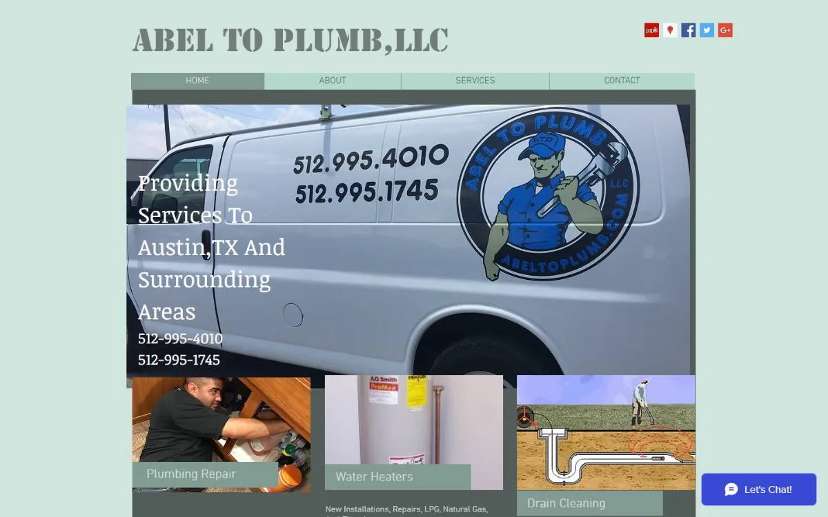
Ugly 85/100 · our take, not a fact
Our take
“Old Wix build in a pale green box with a stencil title, a van photo slider and dead Google+ icons, plus a Go to App banner on the phone. Phone numbers are only plain text, no call or book buttons.”
Editorial commentary about the interface design only.
Ugly Score
85/100
Our take, not a fact
A playful, subjective measure of how strongly this design channels an earlier web. It says nothing about the business itself. How we score
What’s the most old-school detail?
Community verdict. One vote each, and you can change your mind.
More from the museum
View all → rubricplumbing.comUgly 39Sample activity
rubricplumbing.com
18commentsPlumbing · US · · Most memorable detail: not voted yet
 citylineairconditioning.comAwkward on mobileUgly 31Sample activity
citylineairconditioning.com
28commentsHVAC · US · · Most memorable detail: Awkward on mobile
 kpostcompany.comUgly 44Sample activity
kpostcompany.com
9commentsRoofing · US · · Most memorable detail: not voted yet
 cosmic-strike-lanes.exampleDated layoutUgly 92Sample activity
cosmic-strike-lanes.example
12commentsBowling alley · United States · · Most memorable detail: Dated layout
Comments (22)
Roast the design, not the people. Keep it about fonts, colors and layouts. Please read the community rules.
Sign in to join the conversation. Voting doesn’t need an account.
Comments tagged sample are sample activity, not real visitor comments.
kern_your_enthusiasmType nerdsample·
I'd frame this.
lighthouse_lenaPerformance nerdsample·
Yes.
padding_paulaUI designersample·
Mystery meat menu, but make it a tasting menu.
spacer_gifWebmaster emeritussample·
Same. I keep coming back to it.
skeuo_samArt directorsample·
Can confirm, opened it on my phone and had to zoom to 400%.
vectorvicIllustratorsample·
Every pixel is a choice and every choice was made.
contrastcopAccessibility advocatesample·
The guestbook would have loved this comment.
the_real_hamburger_menuUX leadsample·
I clicked the triangle and got the contact page. Love a surprise.
swatch_solColoristsample·
Mystery meat menu, but make it a tasting menu.
cssquirrelFrontend devsample·
Navigation by vibes only.
tablesforlayoutWebmaster emeritussample·
Bookmarked.
halftone_hankArt directorsample·
You can't teach this kind of energy.
z_index_9999Frontend devsample·
Mystery meat menu, but make it a tasting menu.
hexhaverBrand designersample·
Underrated take.
bevelboiRetro collectorsample·
Majestic.
under_construction_umaRetro collectorsample·
Navigation by vibes only.
lorem_ipsum_louCopywritersample·
Ha! Exactly what I thought.
webring_waltWebmaster emeritussample·
Navigation by vibes only.
gradient_gretaBrand designersample·
My grid is crying, my heart is smiling.
flexbox_fionaFrontend devsample·
Respectfully, the tiny fonts are a feature for people with eagle eyes.
moodboard_maxArt directorsample·
This site has never heard of a design system and it's thriving.
gridlockedFrontend devsample·
The color palette is doing a lot: saturated primaries, a tiled background and text sitting right on top of it. Contrast checker would file a complaint, but as a piece of web history it's flawless. This is exactly the energy the early web had before everything became beige cards.