alphabuilt.com
Texas, US · posted
Captured on 17 November 2026. The live site may have changed.
Votes, comments and dates include sample activity.
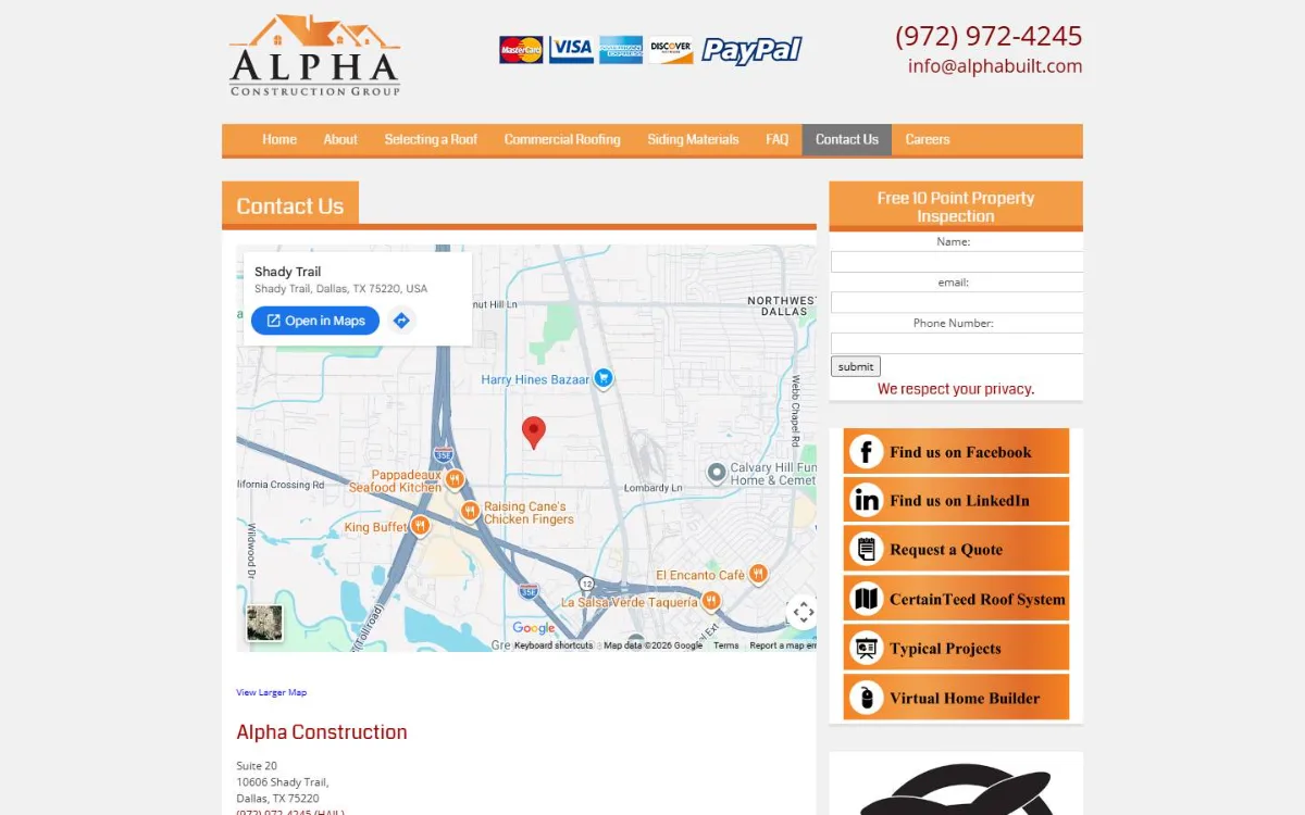
Ugly 80/100 · our take, not a fact
Our take
“Dated boxed orange layout from 2018 with credit card logos in the header, and the page shown is a contact page with a big map. On a phone the number is plain text and there is no button until well below the fold.”
Editorial commentary about the interface design only.
Ugly Score
80/100
Our take, not a fact
A playful, subjective measure of how strongly this design channels an earlier web. It says nothing about the business itself. How we score
What’s the most old-school detail?
Community verdict. One vote each, and you can change your mind.
More from the museum
View all → rubricplumbing.comUgly 39Sample activity
rubricplumbing.com
18commentsPlumbing · US · · Most memorable detail: not voted yet
 citylineairconditioning.comAwkward on mobileUgly 31Sample activity
citylineairconditioning.com
28commentsHVAC · US · · Most memorable detail: Awkward on mobile
 kpostcompany.comUgly 44Sample activity
kpostcompany.com
9commentsRoofing · US · · Most memorable detail: not voted yet
 cosmic-strike-lanes.exampleDated layoutUgly 92Sample activity
cosmic-strike-lanes.example
12commentsBowling alley · United States · · Most memorable detail: Dated layout
Comments (13)
Roast the design, not the people. Keep it about fonts, colors and layouts. Please read the community rules.
Sign in to join the conversation. Voting doesn’t need an account.
Comments tagged sample are sample activity, not real visitor comments.
tracking_tessType nerdsample·
Responsive? It responds to pinch-zoom, that counts.
nostalgia_ninjaRetro collectorsample·
Iconic.
dial_up_dotRetro collectorsample·
Peak web.
affordance_ashUX leadsample·
Committed.
motionsicknessMotion designersample·
Somebody give this an award for confidence.
the_real_hamburger_menuUX leadsample·
Majestic.
gradient_gretaBrand designersample·
Art.
lighthouse_lenaPerformance nerdsample·
Navigation by vibes only.
flexbox_fionaFrontend devsample·
Mobile view is a masterclass in pinch-to-zoom cardio. The desktop version though? Cohesive, in its own way. Everything is aligned to the table cells, which is more consistency than some modern sites manage.
skeuo_samArt directorsample·
This grid was built with <td> and love.
kern_your_enthusiasmType nerdsample·
Vibes.
padding_paulaUI designersample·
Respectfully, the tiny fonts are a feature for people with eagle eyes.
pixel_pilgrimDesign studentsample·
Ha! Exactly what I thought.