bfmechanicalinc.com
Texas, US · posted
Captured on 17 November 2026. The live site may have changed.
Votes, comments and dates include sample activity.
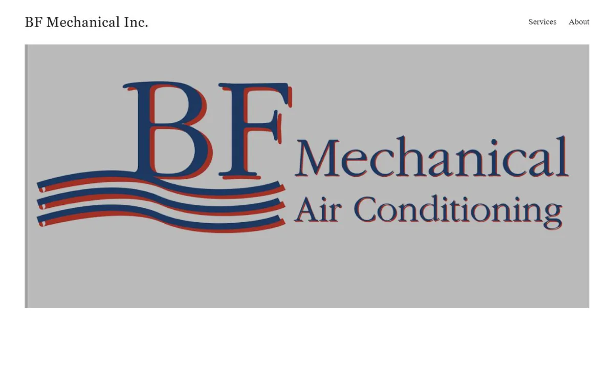
Ugly 85/100 · our take, not a fact
Our take
“Roy (Site Rating Desk) scored look 1/10 and conversion 2/10 (design 15/100) and would pitch a new site.”
Editorial commentary about the interface design only.
Ugly Score
85/100
Our take, not a fact
A playful, subjective measure of how strongly this design channels an earlier web. It says nothing about the business itself. How we score
More from the museum
View all → rubricplumbing.comUgly 39Sample activity
rubricplumbing.com
18commentsPlumbing · US · · Most memorable detail: not voted yet
 citylineairconditioning.comAwkward on mobileUgly 31Sample activity
citylineairconditioning.com
28commentsHVAC · US · · Most memorable detail: Awkward on mobile
 kpostcompany.comUgly 44Sample activity
kpostcompany.com
9commentsRoofing · US · · Most memorable detail: not voted yet
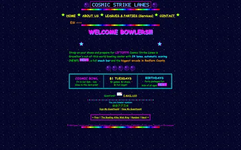 cosmic-strike-lanes.exampleDated layoutUgly 92Sample activity
cosmic-strike-lanes.example
12commentsBowling alley · United States · · Most memorable detail: Dated layout
Comments (6)
Roast the design, not the people. Keep it about fonts, colors and layouts. Please read the community rules.
Sign in to join the conversation. Voting doesn’t need an account.
Comments tagged sample are sample activity, not real visitor comments.
kerning_kidType nerdsample·
Peak web.
serifinsightType nerdsample·
From a UX point of view the navigation is an adventure. I clicked what I thought was 'Services' and found the contact page, which honestly made me more curious. Mystery meat navigation, but artisanal.
vectorvicIllustratorsample·
As a recovering table-layout user I feel seen.
gridlockedFrontend devsample·
Same. I keep coming back to it.
marquee_melMotion designersample·
I showed this to my design team and now we're doing a retro sprint.
tracking_tessType nerdsample·
Hypnotic.