dallascommercialroofingcoatings.com
Texas, US · posted
Captured on 17 November 2026. The live site may have changed.
Votes, comments and dates include sample activity.

Ugly 66/100 · our take, not a fact
Our take
“Basic contractor-network template with a washed-out hero, the logo floating over the photo and a plain checklist of services. Mobile has a sticky call bar, though it shows a different number than the header.”
Editorial commentary about the interface design only.
Ugly Score
66/100
Our take, not a fact
A playful, subjective measure of how strongly this design channels an earlier web. It says nothing about the business itself. How we score
More from the museum
View all →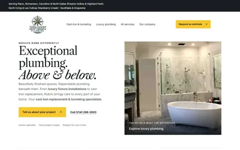 rubricplumbing.comUgly 39Sample activity
rubricplumbing.com
18commentsPlumbing · US · · Most memorable detail: not voted yet
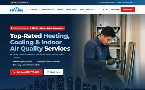 citylineairconditioning.comAwkward on mobileUgly 31Sample activity
citylineairconditioning.com
28commentsHVAC · US · · Most memorable detail: Awkward on mobile
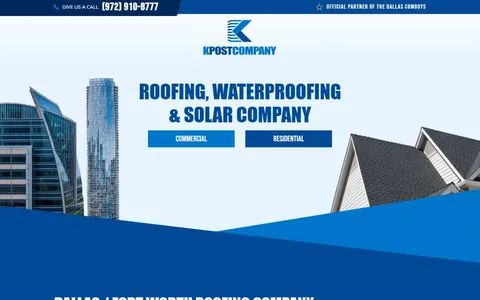 kpostcompany.comUgly 44Sample activity
kpostcompany.com
9commentsRoofing · US · · Most memorable detail: not voted yet
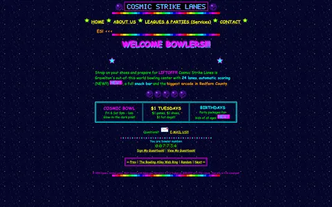 cosmic-strike-lanes.exampleDated layoutUgly 92Sample activity
cosmic-strike-lanes.example
12commentsBowling alley · United States · · Most memorable detail: Dated layout
Comments (10)
Roast the design, not the people. Keep it about fonts, colors and layouts. Please read the community rules.
Sign in to join the conversation. Voting doesn’t need an account.
Comments tagged sample are sample activity, not real visitor comments.
flexbox_fionaFrontend devsample·
I showed this to my design team and now we're doing a retro sprint.
hexhaverBrand designersample·
Every pixel is a choice and every choice was made.
dropshadowdanRetro collectorsample·
This comment is also in my inspiration folder now.
kern_your_enthusiasmType nerdsample·
Hard disagree, the marquee is the real star.
webring_waltWebmaster emeritussample·
Respectfully, the tiny fonts are a feature for people with eagle eyes.
tracking_tessType nerdsample·
This is what websites looked like when they were fun.
padding_paulaUI designersample·
Love that the footer still proudly lists the copyright year from the last time anyone touched the design. It's like a little museum placard.
rgb_rebelBrand designersample·
This loads in my memories before it loads in my browser.
hover_state_halInteraction designersample·
As a type person I have to point out: there are at least four typefaces fighting for the headline and somehow the decorative one is winning. The body copy at 10px is a dare. Still, the hierarchy is weirdly readable once your eyes adjust.
halftone_hankArt directorsample·
It's giving GeoCities homecoming.