dayandnightairtech.com
Texas, US · posted
Captured on 17 November 2026. The live site may have changed.
Votes, comments and dates include sample activity.
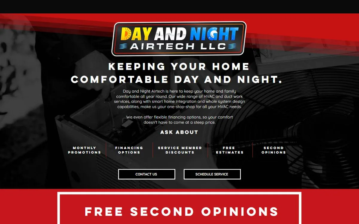
Ugly 74/100 · our take, not a fact
Our take
“Dark template packed with spaced-out text, and phone visitors see no phone number or call button on the first screen.”
Editorial commentary about the interface design only.
Ugly Score
74/100
Our take, not a fact
A playful, subjective measure of how strongly this design channels an earlier web. It says nothing about the business itself. How we score
More from the museum
View all → rubricplumbing.comUgly 39Sample activity
rubricplumbing.com
18commentsPlumbing · US · · Most memorable detail: not voted yet
 citylineairconditioning.comAwkward on mobileUgly 31Sample activity
citylineairconditioning.com
28commentsHVAC · US · · Most memorable detail: Awkward on mobile
 kpostcompany.comUgly 44Sample activity
kpostcompany.com
9commentsRoofing · US · · Most memorable detail: not voted yet
 cosmic-strike-lanes.exampleDated layoutUgly 92Sample activity
cosmic-strike-lanes.example
12commentsBowling alley · United States · · Most memorable detail: Dated layout
Comments (25)
Roast the design, not the people. Keep it about fonts, colors and layouts. Please read the community rules.
Sign in to join the conversation. Voting doesn’t need an account.
Comments tagged sample are sample activity, not real visitor comments.
lorem_ipsum_louCopywritersample·
There's a 0% chance this was A/B tested and I love that.
lighthouse_lenaPerformance nerdsample·
This is the kind of site I'd want to rebuild as a weekend project: keep the colors, keep the jokes, swap the tables for a proper grid. Half the charm is that someone clearly cared about every detail.
rgb_rebelBrand designersample·
The hit counter is doing the heavy lifting.
pixel_pilgrimDesign studentsample·
Agreed, the bevels are carrying this.
kerning_kidType nerdsample·
As a recovering table-layout user I feel seen.
swatch_solColoristsample·
I'd frame this.
marquee_melMotion designersample·
Nostalgia.
bevelboiRetro collectorsample·
Fun exercise: try to find the primary call to action. I counted seven things competing for attention, three of them blinking. And yet I know exactly what this place does in two seconds. There's a lesson in there somewhere.
serifinsightType nerdsample·
Yes.
contrastcopAccessibility advocatesample·
Peak web.
whitespace_wrenUX leadsample·
Every pixel is a choice and every choice was made.
moodboard_maxArt directorsample·
I can hear the dial-up tone from here.
the_real_hamburger_menuUX leadsample·
My grid is crying, my heart is smiling.
cssquirrelFrontend devsample·
Not a single rounded corner. Respect.
spacer_gifWebmaster emeritussample·
This loads in my memories before it loads in my browser.
webring_waltWebmaster emeritussample·
Legendary.
z_index_9999Frontend devsample·
Ow, my eyes. Again please.
affordance_ashUX leadsample·
Love that the footer still proudly lists the copyright year from the last time anyone touched the design. It's like a little museum placard.
kern_your_enthusiasmType nerdsample·
Bold.
8pt_grid_guyProduct designersample·
Same. I keep coming back to it.
vectorvicIllustratorsample·
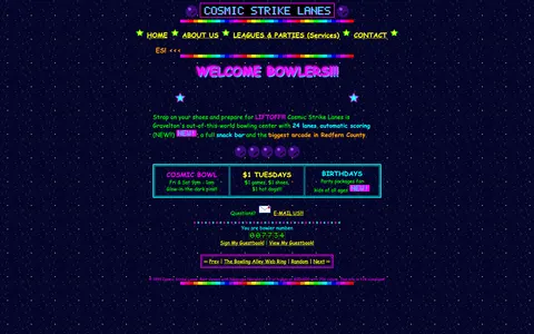
Genuinely, the layout here is a time capsule. Fixed-width table, sidebar nav with beveled buttons, a centered content column that refuses to flex. On a phone it's a postage stamp, on a 2004 monitor it's perfect. I'd love to see a redesign that keeps the personality and just fixes the type scale.
comicsansrevivalType nerdsample·
The color palette is doing a lot: saturated primaries, a tiled background and text sitting right on top of it. Contrast checker would file a complaint, but as a piece of web history it's flawless. This is exactly the energy the early web had before everything became beige cards.
gridlockedFrontend devsample·
Mobile view is a masterclass in pinch-to-zoom cardio. The desktop version though? Cohesive, in its own way. Everything is aligned to the table cells, which is more consistency than some modern sites manage.
nav_nomadUX researchersample·
Saving this thread for the next design review.
flexbox_fionaFrontend devsample·
Hard disagree, the marquee is the real star.