duarteshvacservices.com
Texas, US · posted
Captured on 17 November 2026. The live site may have changed.
Votes, comments and dates include sample activity.

Ugly 75/100 · our take, not a fact
Our take
“Roy (Site Rating Desk) scored look 2/10 and conversion 3/10 (design 25/100) and would pitch a new site.”
Editorial commentary about the interface design only.
Ugly Score
75/100
Our take, not a fact
A playful, subjective measure of how strongly this design channels an earlier web. It says nothing about the business itself. How we score
More from the museum
View all →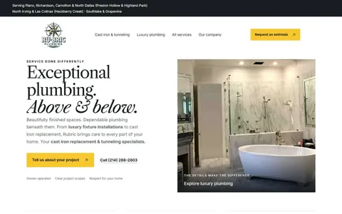 rubricplumbing.comUgly 39Sample activity
rubricplumbing.com
18commentsPlumbing · US · · Most memorable detail: not voted yet
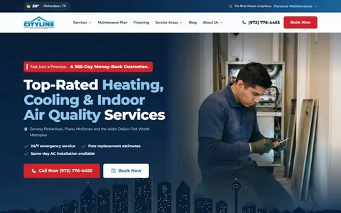 citylineairconditioning.comAwkward on mobileUgly 31Sample activity
citylineairconditioning.com
28commentsHVAC · US · · Most memorable detail: Awkward on mobile
 kpostcompany.comUgly 44Sample activity
kpostcompany.com
9commentsRoofing · US · · Most memorable detail: not voted yet
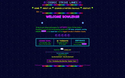 cosmic-strike-lanes.exampleDated layoutUgly 92Sample activity
cosmic-strike-lanes.example
12commentsBowling alley · United States · · Most memorable detail: Dated layout
Comments (9)
Roast the design, not the people. Keep it about fonts, colors and layouts. Please read the community rules.
Sign in to join the conversation. Voting doesn’t need an account.
Comments tagged sample are sample activity, not real visitor comments.
serifinsightType nerdsample·
Honestly better than half the SaaS landing pages I see.
nav_nomadUX researchersample·
The animated GIFs are perfectly timed to be slightly out of sync with each other, which creates a kind of visual polyrhythm. Accidental or not, it's mesmerising.
lorem_ipsum_louCopywritersample·
Agreed, the bevels are carrying this.
spacer_gifWebmaster emeritussample·
It's giving GeoCities homecoming.
gridlockedFrontend devsample·
The color palette is doing a lot: saturated primaries, a tiled background and text sitting right on top of it. Contrast checker would file a complaint, but as a piece of web history it's flawless. This is exactly the energy the early web had before everything became beige cards.
kerning_kidType nerdsample·
No cookie banner. A simpler time.
nostalgia_ninjaRetro collectorsample·
Committed.
the_real_hamburger_menuUX leadsample·
Saving this thread for the next design review.
kern_your_enthusiasmType nerdsample·
There's a 0% chance this was A/B tested and I love that.