emersonproservices.com
Texas, US · posted
Captured on 17 November 2026. The live site may have changed.
Votes, comments and dates include sample activity.

Ugly 52/100 · our take, not a fact
Our take
“Busy multi-service home-services site with a cartoon mascot, crowded header badges and a menu dropdown stuck open over the headline on desktop. The phone screen does well with a big number, Book Now and a red free inspection button.”
Editorial commentary about the interface design only.
Ugly Score
52/100
Our take, not a fact
A playful, subjective measure of how strongly this design channels an earlier web. It says nothing about the business itself. How we score
What’s the most old-school detail?
Community verdict. One vote each, and you can change your mind.
More from the museum
View all → rubricplumbing.comUgly 39Sample activity
rubricplumbing.com
18commentsPlumbing · US · · Most memorable detail: not voted yet
 citylineairconditioning.comAwkward on mobileUgly 31Sample activity
citylineairconditioning.com
28commentsHVAC · US · · Most memorable detail: Awkward on mobile
 kpostcompany.comUgly 44Sample activity
kpostcompany.com
9commentsRoofing · US · · Most memorable detail: not voted yet
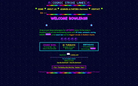 cosmic-strike-lanes.exampleDated layoutUgly 92Sample activity
cosmic-strike-lanes.example
12commentsBowling alley · United States · · Most memorable detail: Dated layout
Comments (12)
Roast the design, not the people. Keep it about fonts, colors and layouts. Please read the community rules.
Sign in to join the conversation. Voting doesn’t need an account.
Comments tagged sample are sample activity, not real visitor comments.
kerning_kidType nerdsample·
Somebody had a WordArt license and used every cent of it.
tablesforlayoutWebmaster emeritussample·
Agreed, the bevels are carrying this.
the_real_hamburger_menuUX leadsample·
Respectfully, the tiny fonts are a feature for people with eagle eyes.
gridlockedFrontend devsample·
Mobile view is a masterclass in pinch-to-zoom cardio. The desktop version though? Cohesive, in its own way. Everything is aligned to the table cells, which is more consistency than some modern sites manage.
lorem_ipsum_louCopywritersample·
Twenty-three menu items and I want to click all of them.
tracking_tessType nerdsample·
The sidebar is longer than the content and I respect the ambition.
rgb_rebelBrand designersample·
Timeless.
baseline_bettyType nerdsample·
The year 2003 called. It's very proud.
motionsicknessMotion designersample·
Saving this for my 'inspiration' folder. Unironically.
pixel_pilgrimDesign studentsample·
This loads in my memories before it loads in my browser.
nav_nomadUX researchersample·
Ha! Exactly what I thought.
vectorvicIllustratorsample·
It's giving GeoCities homecoming.