lexairconditioning.com
Texas, US · posted
Captured on 17 November 2026. The live site may have changed.
Votes, comments and dates include sample activity.
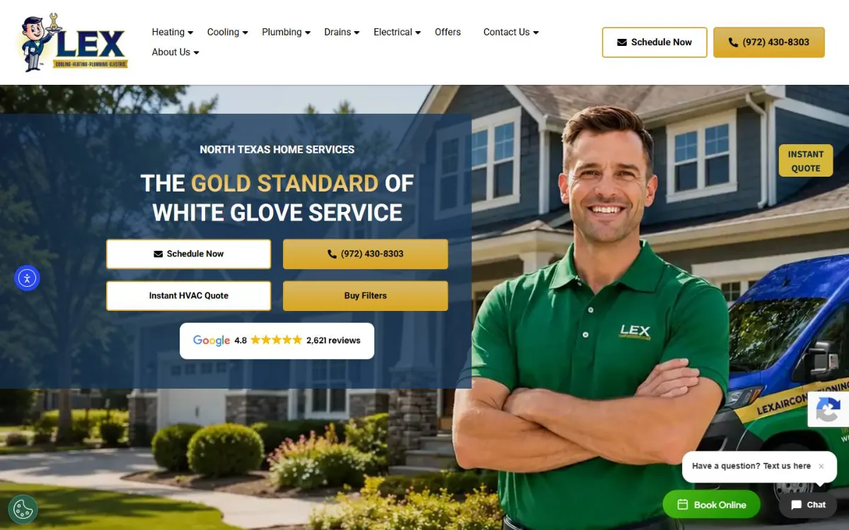
Ugly 42/100 · our take, not a fact
Our take
“Polished home-services template with a mascot logo and stock technician photo, but cluttered with chat, text, cookie and accessibility widgets; it is a multi-trade HVAC and plumbing company that also does electrical. Conversion is strong: big Schedule and call buttons, Google rating and Book Online right on the first phone screen.”
Editorial commentary about the interface design only.
Ugly Score
42/100
Our take, not a fact
A playful, subjective measure of how strongly this design channels an earlier web. It says nothing about the business itself. How we score
What’s the most old-school detail?
Community verdict. One vote each, and you can change your mind.
More from the museum
View all → rubricplumbing.comUgly 39Sample activity
rubricplumbing.com
18commentsPlumbing · US · · Most memorable detail: not voted yet
 citylineairconditioning.comAwkward on mobileUgly 31Sample activity
citylineairconditioning.com
28commentsHVAC · US · · Most memorable detail: Awkward on mobile
 kpostcompany.comUgly 44Sample activity
kpostcompany.com
9commentsRoofing · US · · Most memorable detail: not voted yet
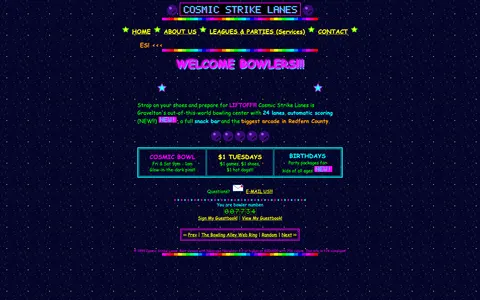 cosmic-strike-lanes.exampleDated layoutUgly 92Sample activity
cosmic-strike-lanes.example
12commentsBowling alley · United States · · Most memorable detail: Dated layout
Comments (8)
Roast the design, not the people. Keep it about fonts, colors and layouts. Please read the community rules.
Sign in to join the conversation. Voting doesn’t need an account.
Comments tagged sample are sample activity, not real visitor comments.
affordance_ashUX leadsample·
The color palette is doing a lot: saturated primaries, a tiled background and text sitting right on top of it. Contrast checker would file a complaint, but as a piece of web history it's flawless. This is exactly the energy the early web had before everything became beige cards.
figma_fernProduct designersample·
Ow, my eyes. Again please.
contrastcopAccessibility advocatesample·
Ha! Exactly what I thought.
bevelboiRetro collectorsample·
Yes.
under_construction_umaRetro collectorsample·
My CRT monitor just woke up from a nap.
gridlockedFrontend devsample·
Respectfully, the tiny fonts are a feature for people with eagle eyes.
nav_nomadUX researchersample·
Twenty-three menu items and I want to click all of them.
vectorvicIllustratorsample·
As a type person I have to point out: there are at least four typefaces fighting for the headline and somehow the decorative one is winning. The body copy at 10px is a dare. Still, the hierarchy is weirdly readable once your eyes adjust.