nuvohvac.com
Texas, US · posted
Captured on 17 November 2026. The live site may have changed.
Votes, comments and dates include sample activity.

Ugly 61/100 · our take, not a fact
Our take
“Roy (Site Rating Desk) scored look 3/10 and conversion 5/10 (design 39/100) and would pitch a new site.”
Editorial commentary about the interface design only.
Ugly Score
61/100
Our take, not a fact
A playful, subjective measure of how strongly this design channels an earlier web. It says nothing about the business itself. How we score
More from the museum
View all → rubricplumbing.comUgly 39Sample activity
rubricplumbing.com
18commentsPlumbing · US · · Most memorable detail: not voted yet
 citylineairconditioning.comAwkward on mobileUgly 31Sample activity
citylineairconditioning.com
28commentsHVAC · US · · Most memorable detail: Awkward on mobile
 kpostcompany.comUgly 44Sample activity
kpostcompany.com
9commentsRoofing · US · · Most memorable detail: not voted yet
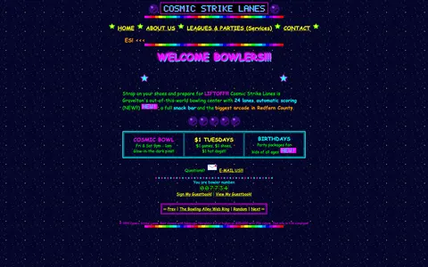 cosmic-strike-lanes.exampleDated layoutUgly 92Sample activity
cosmic-strike-lanes.example
12commentsBowling alley · United States · · Most memorable detail: Dated layout
Comments (9)
Roast the design, not the people. Keep it about fonts, colors and layouts. Please read the community rules.
Sign in to join the conversation. Voting doesn’t need an account.
Comments tagged sample are sample activity, not real visitor comments.
webring_waltWebmaster emeritussample·
I can hear the dial-up tone from here.
bevelboiRetro collectorsample·
The color palette is doing a lot: saturated primaries, a tiled background and text sitting right on top of it. Contrast checker would file a complaint, but as a piece of web history it's flawless. This is exactly the energy the early web had before everything became beige cards.
gridlockedFrontend devsample·
Genuinely, the layout here is a time capsule. Fixed-width table, sidebar nav with beveled buttons, a centered content column that refuses to flex. On a phone it's a postage stamp, on a 2004 monitor it's perfect. I'd love to see a redesign that keeps the personality and just fixes the type scale.
dial_up_dotRetro collectorsample·
Gorgeous chaos.
hover_state_halInteraction designersample·
I teach an intro web design class and I'm going to show this next week, not as a 'don't', but as a 'look how much personality you can have'. Then we'll talk about viewport meta tags.
vectorvicIllustratorsample·
The animated GIFs are perfectly timed to be slightly out of sync with each other, which creates a kind of visual polyrhythm. Accidental or not, it's mesmerising.
pixel_pilgrimDesign studentsample·
Somebody give this an award for confidence.
lighthouse_lenaPerformance nerdsample·
Mobile view is a masterclass in pinch-to-zoom cardio. The desktop version though? Cohesive, in its own way. Everything is aligned to the table cells, which is more consistency than some modern sites manage.
flexbox_fionaFrontend devsample·
This is the kind of site I'd want to rebuild as a weekend project: keep the colors, keep the jokes, swap the tables for a proper grid. Half the charm is that someone clearly cared about every detail.