proservicesdfw.com
Texas, US · posted
Captured on 17 November 2026. The live site may have changed.
Votes, comments and dates include sample activity.
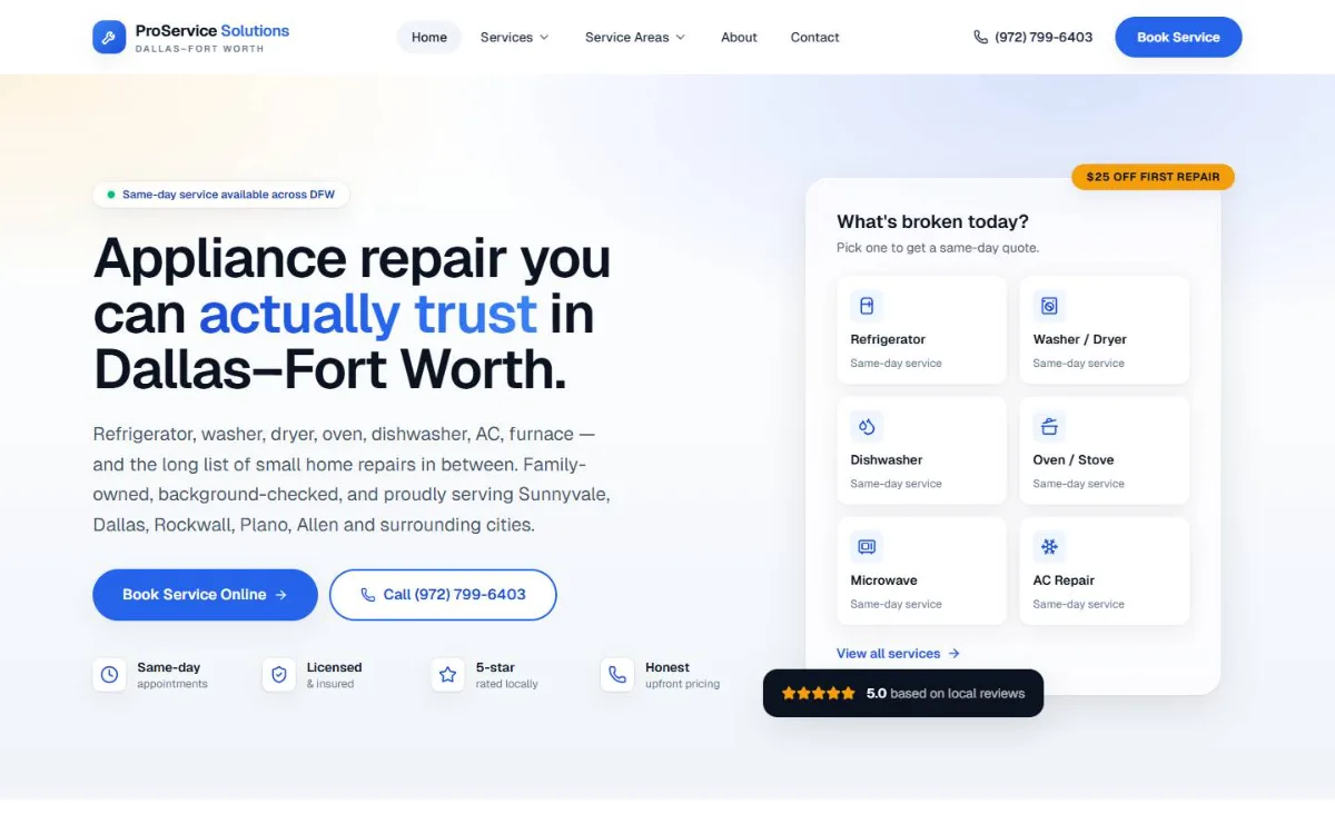
Ugly 46/100 · our take, not a fact
Our take
“This is mainly an appliance repair company, not an HVAC contractor; booking is very easy with big Book and Call buttons and a sticky Call/Text/Book bar, but the clean look is a generic template with no real photos.”
Editorial commentary about the interface design only.
Ugly Score
46/100
Our take, not a fact
A playful, subjective measure of how strongly this design channels an earlier web. It says nothing about the business itself. How we score
What’s the most old-school detail?
Community verdict. One vote each, and you can change your mind.
More from the museum
View all →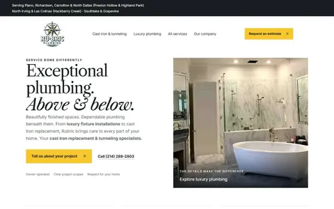 rubricplumbing.comUgly 39Sample activity
rubricplumbing.com
18commentsPlumbing · US · · Most memorable detail: not voted yet
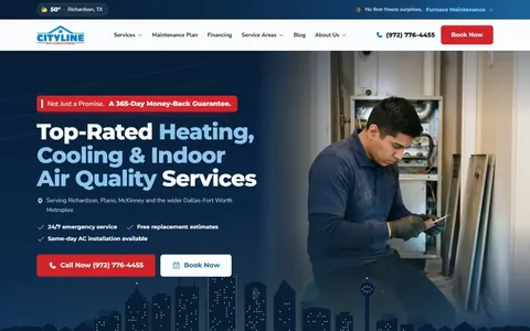 citylineairconditioning.comAwkward on mobileUgly 31Sample activity
citylineairconditioning.com
28commentsHVAC · US · · Most memorable detail: Awkward on mobile
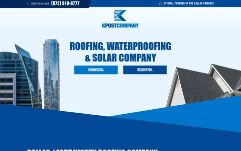 kpostcompany.comUgly 44Sample activity
kpostcompany.com
9commentsRoofing · US · · Most memorable detail: not voted yet
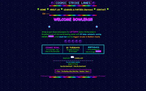 cosmic-strike-lanes.exampleDated layoutUgly 92Sample activity
cosmic-strike-lanes.example
12commentsBowling alley · United States · · Most memorable detail: Dated layout
Comments (16)
Roast the design, not the people. Keep it about fonts, colors and layouts. Please read the community rules.
Sign in to join the conversation. Voting doesn’t need an account.
Comments tagged sample are sample activity, not real visitor comments.
flexbox_fionaFrontend devsample·
Fun exercise: try to find the primary call to action. I counted seven things competing for attention, three of them blinking. And yet I know exactly what this place does in two seconds. There's a lesson in there somewhere.
lighthouse_lenaPerformance nerdsample·
As a recovering table-layout user I feel seen.
baseline_bettyType nerdsample·
This is the website equivalent of a lava lamp.
vectorvicIllustratorsample·
As a type person I have to point out: there are at least four typefaces fighting for the headline and somehow the decorative one is winning. The body copy at 10px is a dare. Still, the hierarchy is weirdly readable once your eyes adjust.
nostalgia_ninjaRetro collectorsample·
It's giving GeoCities homecoming.
dial_up_dotRetro collectorsample·
Bookmarked.
swatch_solColoristsample·
Mobile view is a masterclass in pinch-to-zoom cardio. The desktop version though? Cohesive, in its own way. Everything is aligned to the table cells, which is more consistency than some modern sites manage.
bevelboiRetro collectorsample·
This comment is also in my inspiration folder now.
pixel_pilgrimDesign studentsample·
I'd frame this.
nav_nomadUX researchersample·
Saving this for my 'inspiration' folder. Unironically.
tracking_tessType nerdsample·
Committed.
under_construction_umaRetro collectorsample·
Table layout spotted. I can feel the colspan from here.
kerning_kidType nerdsample·
I'm putting this in my portfolio as 'inspired by'.
padding_paulaUI designersample·
Ha! Exactly what I thought.
rgb_rebelBrand designersample·
This site has never heard of a design system and it's thriving.
the_real_hamburger_menuUX leadsample·
My grid is crying, my heart is smiling.