coolmetoday.com
Texas, US · posted
Captured on 17 November 2026. The live site may have changed.
Votes, comments and dates include sample activity.
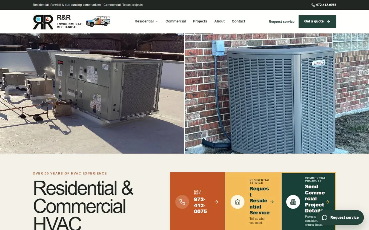
Ugly 55/100 · our take, not a fact
Our take
“Has a distinct earthy color scheme and real job photos, but the button text breaks awkwardly and the headline and Call button sit below two big equipment photos.”
Editorial commentary about the interface design only.
Ugly Score
55/100
Our take, not a fact
A playful, subjective measure of how strongly this design channels an earlier web. It says nothing about the business itself. How we score
More from the museum
View all →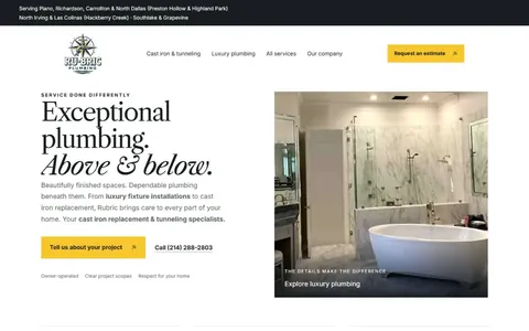 rubricplumbing.comUgly 39Sample activity
rubricplumbing.com
18commentsPlumbing · US · · Most memorable detail: not voted yet
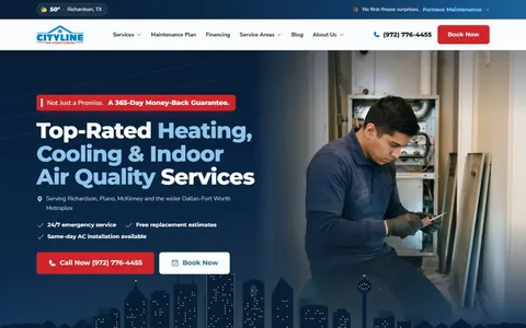 citylineairconditioning.comAwkward on mobileUgly 31Sample activity
citylineairconditioning.com
28commentsHVAC · US · · Most memorable detail: Awkward on mobile
 kpostcompany.comUgly 44Sample activity
kpostcompany.com
9commentsRoofing · US · · Most memorable detail: not voted yet
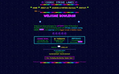 cosmic-strike-lanes.exampleDated layoutUgly 92Sample activity
cosmic-strike-lanes.example
12commentsBowling alley · United States · · Most memorable detail: Dated layout
Comments (16)
Roast the design, not the people. Keep it about fonts, colors and layouts. Please read the community rules.
Sign in to join the conversation. Voting doesn’t need an account.
Comments tagged sample are sample activity, not real visitor comments.
skeuo_samArt directorsample·
Peak web.
dropshadowdanRetro collectorsample·
Ha! Exactly what I thought.
z_index_9999Frontend devsample·
100%. The personality is the feature.
under_construction_umaRetro collectorsample·
Love that the footer still proudly lists the copyright year from the last time anyone touched the design. It's like a little museum placard.
serifinsightType nerdsample·
No cookie banner. A simpler time.
vectorvicIllustratorsample·
Somebody pin this.
marquee_melMotion designersample·
I showed this to my design team and now we're doing a retro sprint.
dial_up_dotRetro collectorsample·
The hit counter is doing the heavy lifting.
motionsicknessMotion designersample·
There's a 0% chance this was A/B tested and I love that.
tracking_tessType nerdsample·
Vibes.
the_real_hamburger_menuUX leadsample·
Committed.
cssquirrelFrontend devsample·
You've clearly never had a spacer.gif and it shows.
contrastcopAccessibility advocatesample·
As a type person I have to point out: there are at least four typefaces fighting for the headline and somehow the decorative one is winning. The body copy at 10px is a dare. Still, the hierarchy is weirdly readable once your eyes adjust.
flexbox_fionaFrontend devsample·
Legendary.
hover_state_halInteraction designersample·
This comment is also in my inspiration folder now.
kerning_kidType nerdsample·
Can confirm, opened it on my phone and had to zoom to 400%.