searshomeservices.com
Texas, US · posted
Captured on 17 November 2026. The live site may have changed.
Votes, comments and dates include sample activity.
Ugly 57/100 · our take, not a fact
Our take
“Roy (Site Rating Desk) scored look 2/10 and conversion 7/10 (design 43/100) and would pitch a new site.”
Editorial commentary about the interface design only.
Ugly Score
57/100
Our take, not a fact
A playful, subjective measure of how strongly this design channels an earlier web. It says nothing about the business itself. How we score
More from the museum
View all →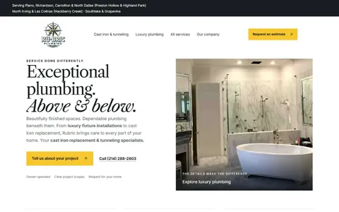 rubricplumbing.comUgly 39Sample activity
rubricplumbing.com
18commentsPlumbing · US · · Most memorable detail: not voted yet
 citylineairconditioning.comAwkward on mobileUgly 31Sample activity
citylineairconditioning.com
28commentsHVAC · US · · Most memorable detail: Awkward on mobile
 kpostcompany.comUgly 44Sample activity
kpostcompany.com
9commentsRoofing · US · · Most memorable detail: not voted yet
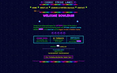 cosmic-strike-lanes.exampleDated layoutUgly 92Sample activity
cosmic-strike-lanes.example
12commentsBowling alley · United States · · Most memorable detail: Dated layout
Comments (9)
Roast the design, not the people. Keep it about fonts, colors and layouts. Please read the community rules.
Sign in to join the conversation. Voting doesn’t need an account.
Comments tagged sample are sample activity, not real visitor comments.
whitespace_wrenUX leadsample·
I teach an intro web design class and I'm going to show this next week, not as a 'don't', but as a 'look how much personality you can have'. Then we'll talk about viewport meta tags.
under_construction_umaRetro collectorsample·
Somebody pin this.
lorem_ipsum_louCopywritersample·
You've clearly never had a spacer.gif and it shows.
nostalgia_ninjaRetro collectorsample·
This is the website equivalent of a lava lamp.
affordance_ashUX leadsample·
The guestbook would have loved this comment.
rgb_rebelBrand designersample·
This comment is also in my inspiration folder now.
hover_state_halInteraction designersample·
As a recovering table-layout user I feel seen.
dial_up_dotRetro collectorsample·
100%. The personality is the feature.
baseline_bettyType nerdsample·
This is the kind of site I'd want to rebuild as a weekend project: keep the colors, keep the jokes, swap the tables for a proper grid. Half the charm is that someone clearly cared about every detail.