stedi.com
posted
Captured on 17 November 2026. The live site may have changed.

Ugly 12/100 · our take, not a fact
Our take
“The only headless clearinghouse and RCM engine is a stark black typographic fold, which is a very 2020s way to sell healthcare infrastructure. Handsome and un-ugly.”
Editorial commentary about the interface design only.
Ugly Score
12/100
Our take, not a fact
A playful, subjective measure of how strongly this design channels an earlier web. It says nothing about the business itself. How we score
What’s the most old-school detail?
Community verdict. One vote each, and you can change your mind.
More from the museum
View all →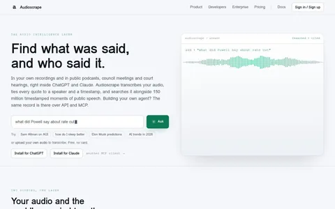 audioscrape.comMystery navigationUgly 16
audioscrape.com
0commentsAudio software · · Most memorable detail: Mystery navigation
 rets.aiStock photo overloadUgly 15
rets.ai
0commentsInvestment software · · Most memorable detail: Stock photo overload
 kolena.comCluttered menusUgly 15
kolena.com
0commentsAI software · · Most memorable detail: Cluttered menus
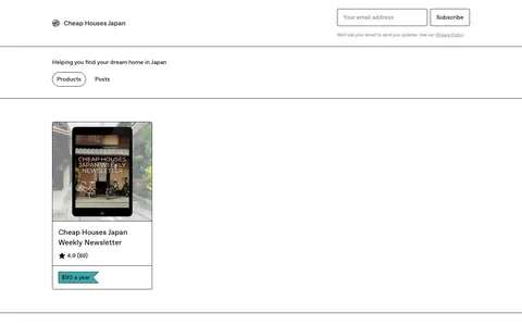 cheaphousesjapan.gumroad.comTiny fontsUgly 23
cheaphousesjapan.gumroad.com
0commentsListings shop · Japan · · Most memorable detail: Tiny fonts
Comments (0)
Roast the design, not the people. Keep it about fonts, colors and layouts. Please read the community rules.
Sign in to join the conversation. Voting doesn’t need an account.
No comments yet. Be the first to point out the beveled buttons.