whistlestop-hobby.example
Upper Tannery Region, Canada · posted
Captured on 8 March 2022. The live site may have changed.
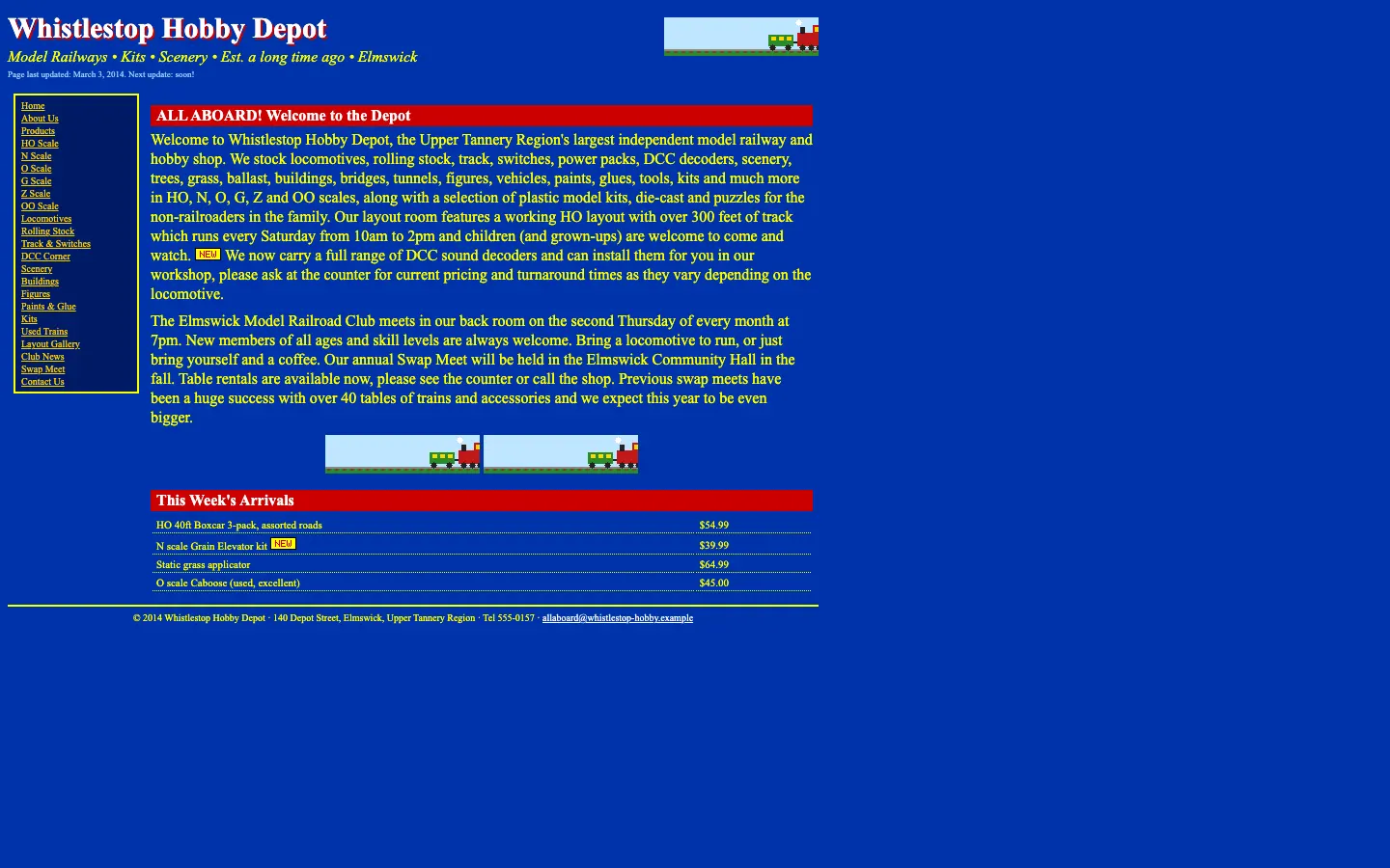
Ugly 84/100 · our take, not a fact
Our take
“Yellow Times on royal blue gives the whole site the energy of a vintage timetable board, and the paragraphs run on like a very long freight train. The little animated locomotive chugging in the header is a genuine delight.”
Editorial commentary about the interface design only.
Ugly Score
84/100
Our take, not a fact
A playful, subjective measure of how strongly this design channels an earlier web. It says nothing about the business itself. How we score
What’s the most old-school detail?
Community verdict. One vote each, and you can change your mind.
More from the museum
View all →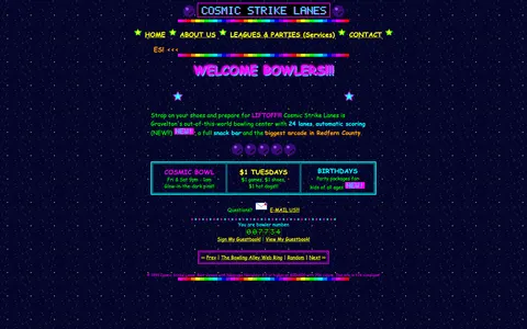 cosmic-strike-lanes.exampleDated layoutUgly 92
cosmic-strike-lanes.example
12commentsBowling alley · United States · · Most memorable detail: Dated layout
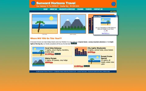 sunward-horizons-travel.examplePopups and autoplayUgly 76
sunward-horizons-travel.example
1commentsTravel agency · New Zealand · · Most memorable detail: Popups and autoplay
 pipe-dreams-plumbing.exampleAwkward on mobileUgly 66
pipe-dreams-plumbing.example
28commentsPlumbing · United Kingdom · · Most memorable detail: Awkward on mobile
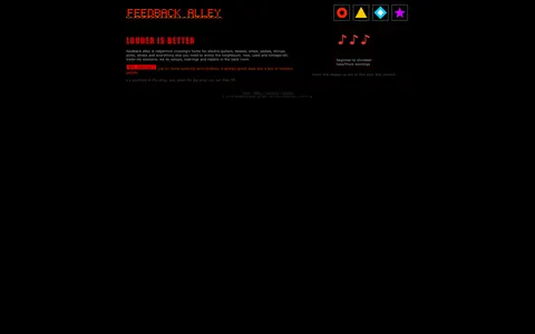 feedback-alley-guitars.exampleDated layoutUgly 86
feedback-alley-guitars.example
2commentsGuitar shop · Canada · · Most memorable detail: Dated layout
Comments (18)
Roast the design, not the people. Keep it about fonts, colors and layouts. Please read the community rules.
Sign in to join the conversation. Voting doesn’t need an account.
Comments tagged demo are simulated activity on this fictional demo exhibit.
whitespace_wrenUX leaddemo·
I showed this to my design team and now we're doing a retro sprint.
vectorvicIllustratordemo·
I'd frame this.
nav_nomadUX researcherdemo·
Somebody give this an award for confidence.
kern_your_enthusiasmType nerddemo·
Saturation: yes.
tablesforlayoutWebmaster emeritusdemo·
Underrated take.
hexhaverBrand designerdemo·
Same. I keep coming back to it.
serifinsightType nerddemo·
I had to zoom in to read the zoom instructions.
motionsicknessMotion designerdemo·
As a recovering table-layout user I feel seen.
halftone_hankArt directordemo·
It's giving GeoCities homecoming.
padding_paulaUI designerdemo·
No cookie banner. A simpler time.
tracking_tessType nerddemo·
I'm putting this in my portfolio as 'inspired by'.
moodboard_maxArt directordemo·
The guestbook would have loved this comment.
8pt_grid_guyProduct designerdemo·
Sublime.
nostalgia_ninjaRetro collectordemo·
Not a single rounded corner. Respect.
figma_fernProduct designerdemo·
Committed.
gradient_gretaBrand designerdemo·
Respectfully, the tiny fonts are a feature for people with eagle eyes.
bevelboiRetro collectordemo·
This is the website equivalent of a lava lamp.
cssquirrelFrontend devdemo·
The guestbook link is calling to me.