bytefixers-pc.example
Kessler County, United States · posted
Captured on 17 October 2021. The live site may have changed.
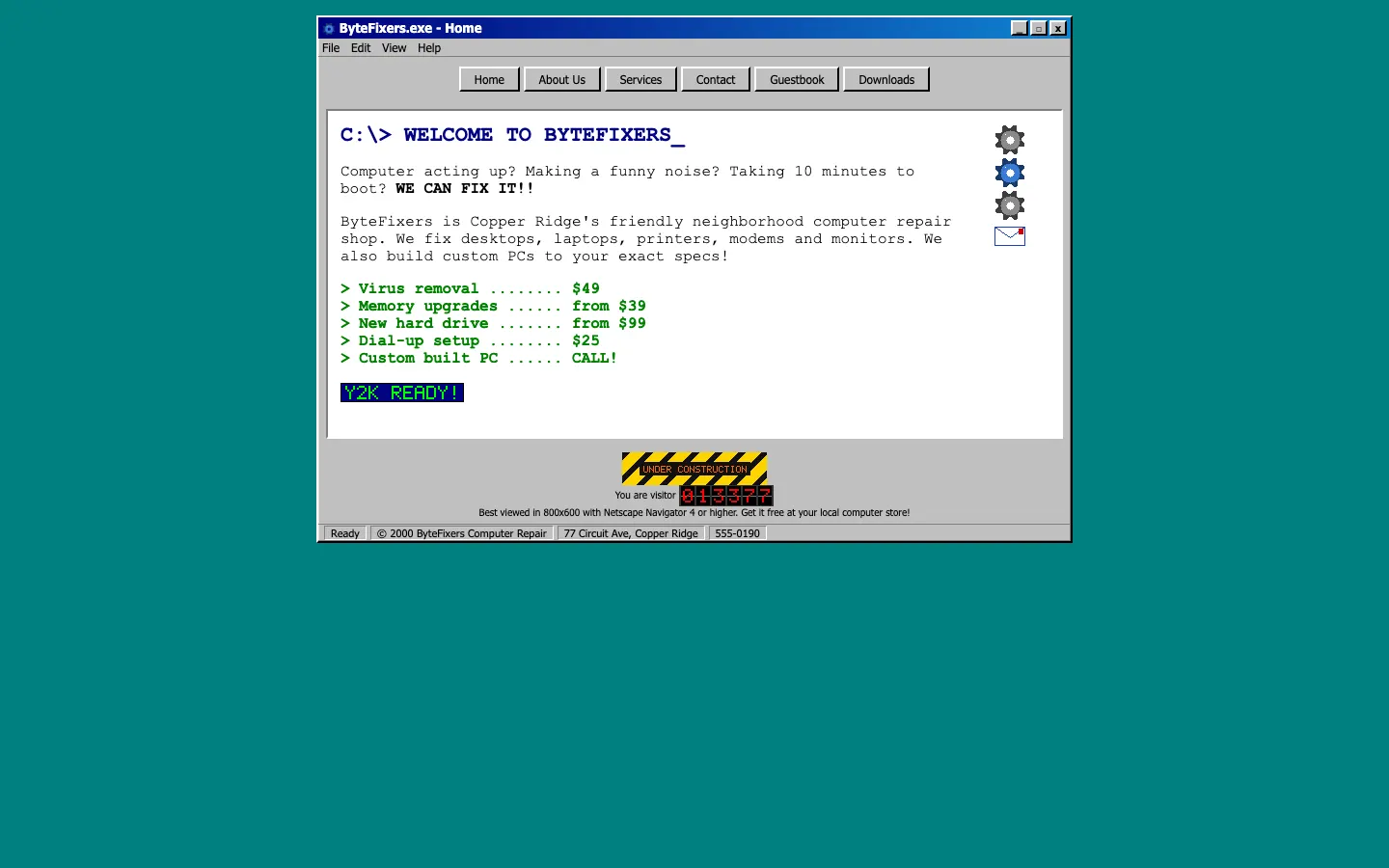
Ugly 80/100 · our take, not a fact
Our take
“The whole site is styled as a desktop program window, complete with a File menu, and the minimize button does absolutely nothing. A blinking Y2K-readiness badge is the perfect finishing touch.”
Editorial commentary about the interface design only.
Ugly Score
80/100
Our take, not a fact
A playful, subjective measure of how strongly this design channels an earlier web. It says nothing about the business itself. How we score
What’s the most old-school detail?
Community verdict. One vote each, and you can change your mind.
More from the museum
View all → cosmic-strike-lanes.exampleDated layoutUgly 92
cosmic-strike-lanes.example
12commentsBowling alley · United States · · Most memorable detail: Dated layout
 sunward-horizons-travel.examplePopups and autoplayUgly 76
sunward-horizons-travel.example
1commentsTravel agency · New Zealand · · Most memorable detail: Popups and autoplay
 pipe-dreams-plumbing.exampleAwkward on mobileUgly 66
pipe-dreams-plumbing.example
28commentsPlumbing · United Kingdom · · Most memorable detail: Awkward on mobile
 whistlestop-hobby.exampleAwkward on mobileUgly 84
whistlestop-hobby.example
18commentsModel trains hobby shop · Canada · · Most memorable detail: Awkward on mobile
Comments (13)
Roast the design, not the people. Keep it about fonts, colors and layouts. Please read the community rules.
Sign in to join the conversation. Voting doesn’t need an account.
Comments tagged demo are simulated activity on this fictional demo exhibit.
cssquirrelFrontend devdemo·
Hypnotic.
webring_waltWebmaster emeritusdemo·
The guestbook link is calling to me.
bevelboiRetro collectordemo·
Hard disagree, the marquee is the real star.
moodboard_maxArt directordemo·
Peak web.
flexbox_fionaFrontend devdemo·
I'm putting this in my portfolio as 'inspired by'.
serifinsightType nerddemo·
Underrated take.
contrastcopAccessibility advocatedemo·
Same. I keep coming back to it.
pixel_pilgrimDesign studentdemo·
Genuinely, the layout here is a time capsule. Fixed-width table, sidebar nav with beveled buttons, a centered content column that refuses to flex. On a phone it's a postage stamp, on a 2004 monitor it's perfect. I'd love to see a redesign that keeps the personality and just fixes the type scale.
whitespace_wrenUX leaddemo·
OK this made me laugh out loud.
padding_paulaUI designerdemo·
Can confirm, opened it on my phone and had to zoom to 400%.
lighthouse_lenaPerformance nerddemo·
My grid is crying, my heart is smiling.
nostalgia_ninjaRetro collectordemo·
The hit counter is doing the heavy lifting.
swatch_solColoristdemo·
Ha! Exactly what I thought.