sprinkle-shack.example
Sunfish Coast, Australia · posted
Captured on 12 May 2022. The live site may have changed.
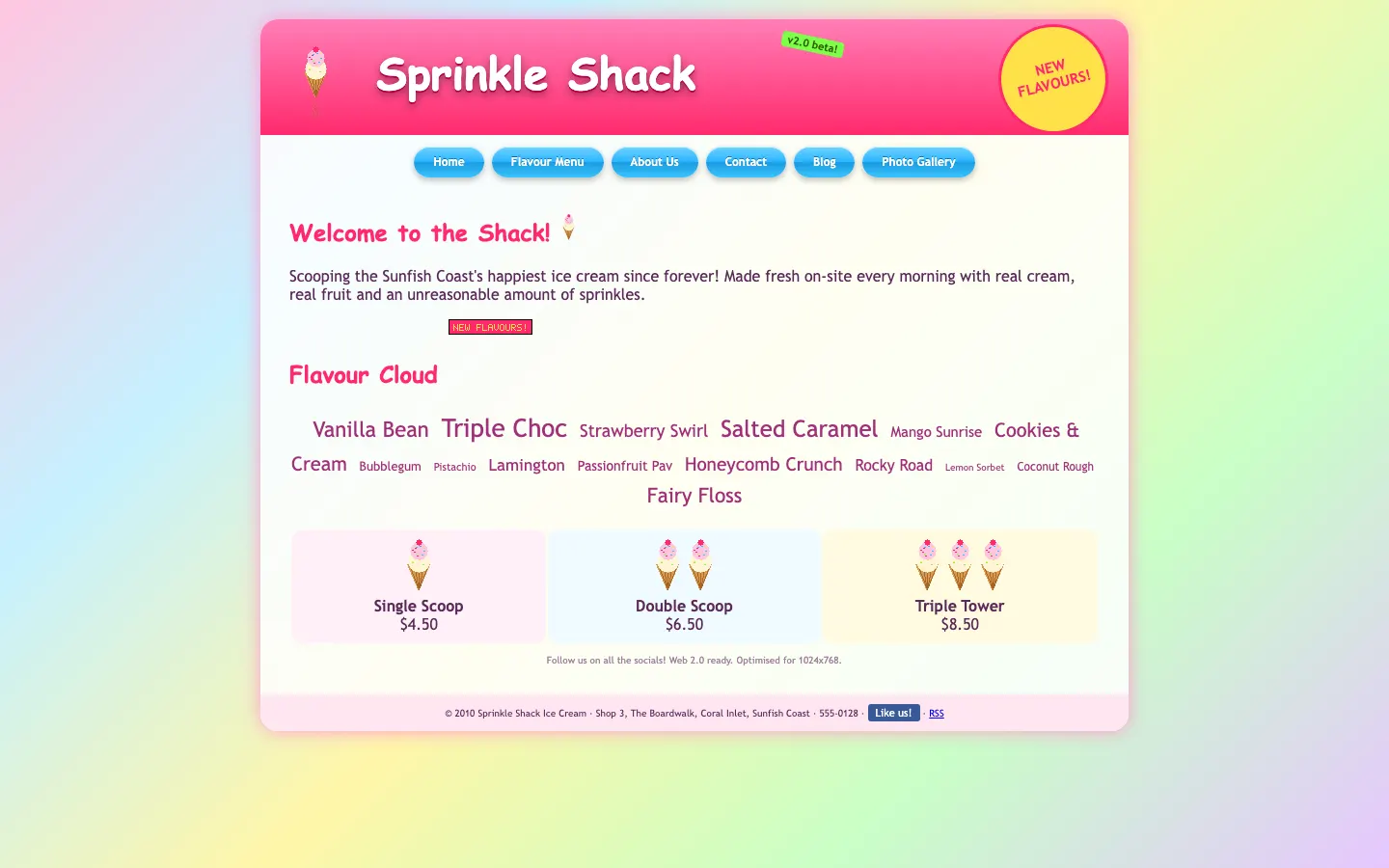
Ugly 60/100 · our take, not a fact
Our take
“Glossy pill buttons, a starburst, a "beta" badge and a flavour tag cloud: this page is a scoop of every web trend from one specific summer. The pastel rainbow background makes the whole screen look like it is melting, slowly.”
Editorial commentary about the interface design only.
Ugly Score
60/100
Our take, not a fact
A playful, subjective measure of how strongly this design channels an earlier web. It says nothing about the business itself. How we score
What’s the most old-school detail?
Community verdict. One vote each, and you can change your mind.
More from the museum
View all → cosmic-strike-lanes.exampleDated layoutUgly 92
cosmic-strike-lanes.example
12commentsBowling alley · United States · · Most memorable detail: Dated layout
 sunward-horizons-travel.examplePopups and autoplayUgly 76
sunward-horizons-travel.example
1commentsTravel agency · New Zealand · · Most memorable detail: Popups and autoplay
 pipe-dreams-plumbing.exampleAwkward on mobileUgly 66
pipe-dreams-plumbing.example
28commentsPlumbing · United Kingdom · · Most memorable detail: Awkward on mobile
 whistlestop-hobby.exampleAwkward on mobileUgly 84
whistlestop-hobby.example
18commentsModel trains hobby shop · Canada · · Most memorable detail: Awkward on mobile
Comments (8)
Roast the design, not the people. Keep it about fonts, colors and layouts. Please read the community rules.
Sign in to join the conversation. Voting doesn’t need an account.
Comments tagged demo are simulated activity on this fictional demo exhibit.
marquee_melMotion designerdemo·
This is the kind of site I'd want to rebuild as a weekend project: keep the colors, keep the jokes, swap the tables for a proper grid. Half the charm is that someone clearly cared about every detail.
whitespace_wrenUX leaddemo·
Yes.
pixel_pilgrimDesign studentdemo·
Responsive? It responds to pinch-zoom, that counts.
gradient_gretaBrand designerdemo·
The guestbook would have loved this comment.
cssquirrelFrontend devdemo·
Same. I keep coming back to it.
baseline_bettyType nerddemo·
The year 2003 called. It's very proud.
bevelboiRetro collectordemo·
Those bevels are thicker than my portfolio.
under_construction_umaRetro collectordemo·
Committed.