sudsy-paws.example
Hollowshire, United Kingdom · posted
Captured on 27 March 2021. The live site may have changed.
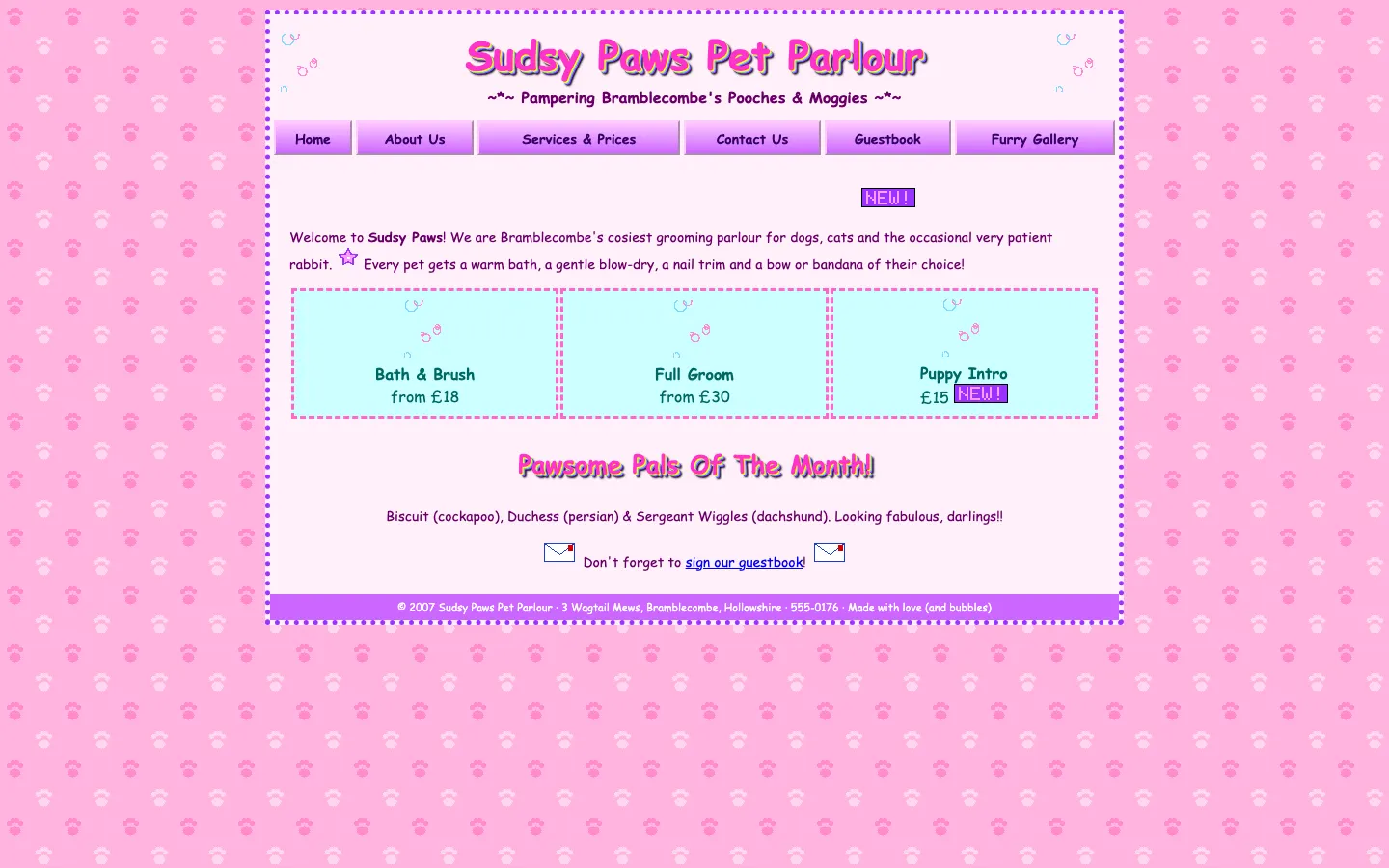
Ugly 70/100 · our take, not a fact
Our take
“The headings wear four stacked text-shadows, which is the closest CSS has ever come to recreating a rainbow WordArt preset. It has a mobile viewport tag and then a fixed 880px box, like putting on running shoes to sit on the couch.”
Editorial commentary about the interface design only.
Ugly Score
70/100
Our take, not a fact
A playful, subjective measure of how strongly this design channels an earlier web. It says nothing about the business itself. How we score
What’s the most old-school detail?
Community verdict. One vote each, and you can change your mind.
More from the museum
View all →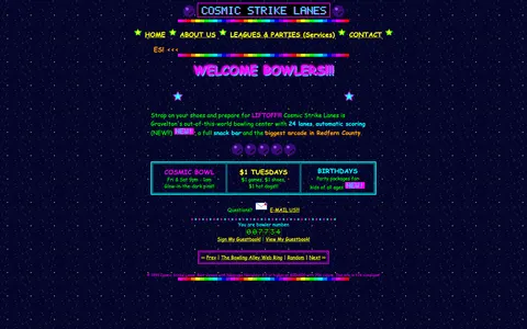 cosmic-strike-lanes.exampleDated layoutUgly 92
cosmic-strike-lanes.example
12commentsBowling alley · United States · · Most memorable detail: Dated layout
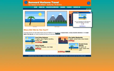 sunward-horizons-travel.examplePopups and autoplayUgly 76
sunward-horizons-travel.example
1commentsTravel agency · New Zealand · · Most memorable detail: Popups and autoplay
 pipe-dreams-plumbing.exampleAwkward on mobileUgly 66
pipe-dreams-plumbing.example
28commentsPlumbing · United Kingdom · · Most memorable detail: Awkward on mobile
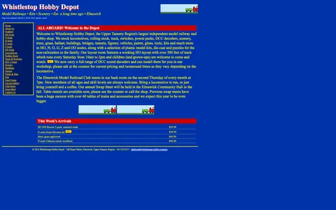 whistlestop-hobby.exampleAwkward on mobileUgly 84
whistlestop-hobby.example
18commentsModel trains hobby shop · Canada · · Most memorable detail: Awkward on mobile
Comments (19)
Roast the design, not the people. Keep it about fonts, colors and layouts. Please read the community rules.
Sign in to join the conversation. Voting doesn’t need an account.
Comments tagged demo are simulated activity on this fictional demo exhibit.
webring_waltWebmaster emeritusdemo·
Those bevels are thicker than my portfolio.
cssquirrelFrontend devdemo·
As a type person I have to point out: there are at least four typefaces fighting for the headline and somehow the decorative one is winning. The body copy at 10px is a dare. Still, the hierarchy is weirdly readable once your eyes adjust.
whitespace_wrenUX leaddemo·
Saturation: yes.
affordance_ashUX leaddemo·
Mobile users get the desktop experience, just smaller. Democracy.
lorem_ipsum_louCopywriterdemo·
There's a 0% chance this was A/B tested and I love that.
comicsansrevivalType nerddemo·
I'd frame this.
swatch_solColoristdemo·
My CPU fan started dancing.
halftone_hankArt directordemo·
Somebody give this an award for confidence.
under_construction_umaRetro collectordemo·
Drop shadow on a drop shadow. Inception.
pixel_pilgrimDesign studentdemo·
Nostalgia.
spacer_gifWebmaster emeritusdemo·
Iconic.
vectorvicIllustratordemo·
Hard disagree, the marquee is the real star.
dial_up_dotRetro collectordemo·
Saving this thread for the next design review.
tablesforlayoutWebmaster emeritusdemo·
Instant serotonin.
padding_paulaUI designerdemo·
Bevels!
nav_nomadUX researcherdemo·
Genuinely, the layout here is a time capsule. Fixed-width table, sidebar nav with beveled buttons, a centered content column that refuses to flex. On a phone it's a postage stamp, on a 2004 monitor it's perfect. I'd love to see a redesign that keeps the personality and just fixes the type scale.
skeuo_samArt directordemo·
Every GIF is on a different beat. It's jazz.
nostalgia_ninjaRetro collectordemo·
I can hear the dial-up tone from here.
gradient_gretaBrand designerdemo·
Committed.